My blog

Just another WordPress site

Visual Thinking Final: What Happens at Night

Full Collection

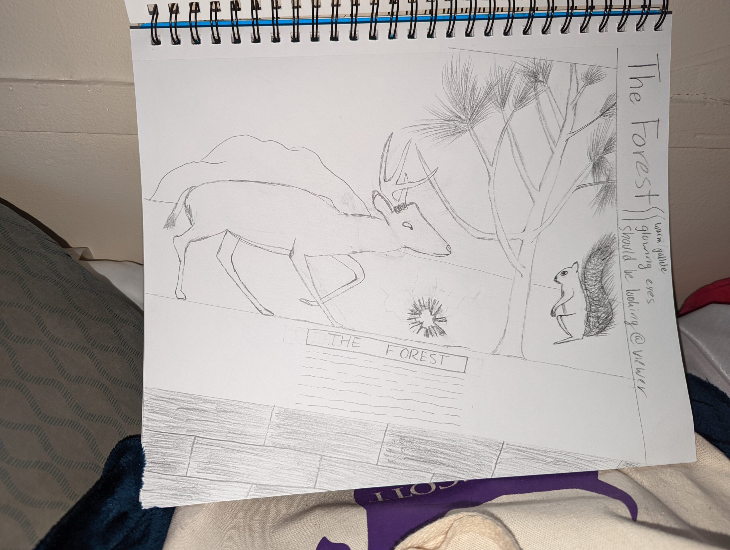
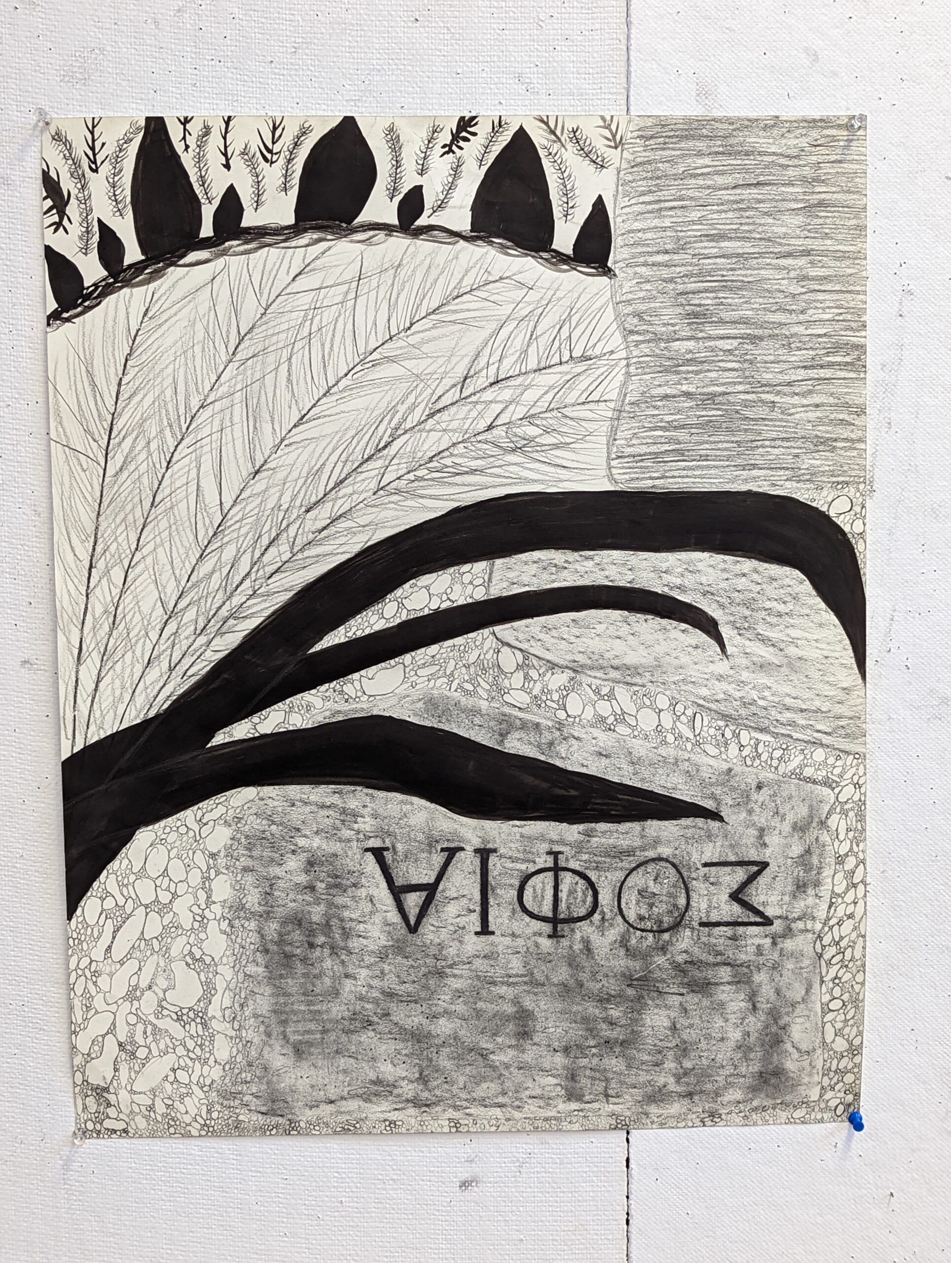
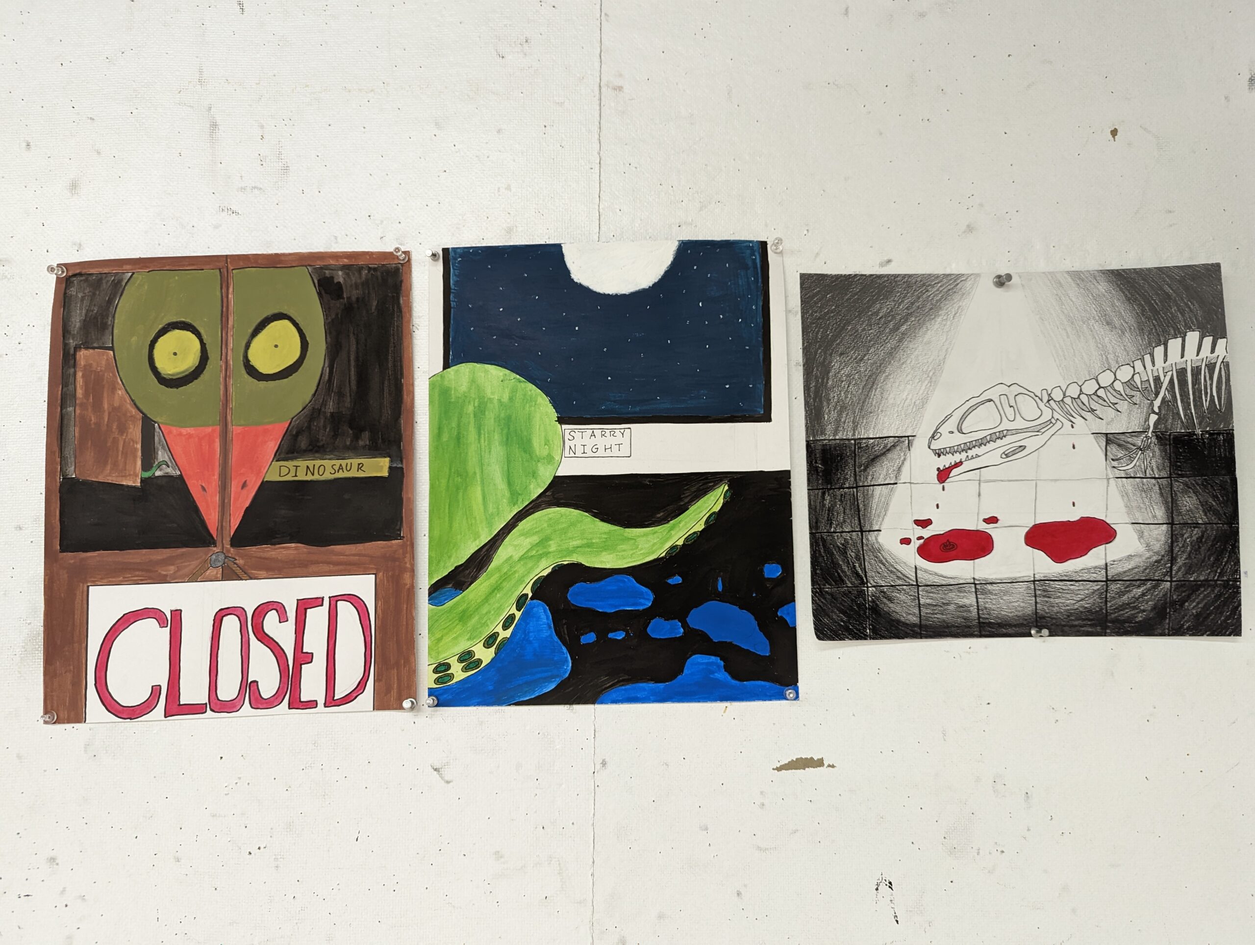
The theme I choose was “What Happens at Night”. I was highly inspired by a movie I watched this semester called Night at The Museum. I had a hard time utilizing the sources I have. I knew I wanted to do the dinosaur one off the bat. The others were a series of picking and choosing an object of focus and a complimentary color palette. At first, I was supposed to be drawing a forest in place of my ‘Closed’ composition, but I didn’t like how the animals were coming out and overall wasn’t a big fan of it. For my ‘Starry Night’ composition I was supposed to just do a starry night with glowing blue figures running around. That unfortunately wouldn’t fit my theme or be drawn from resources either.

‘CLOSED’

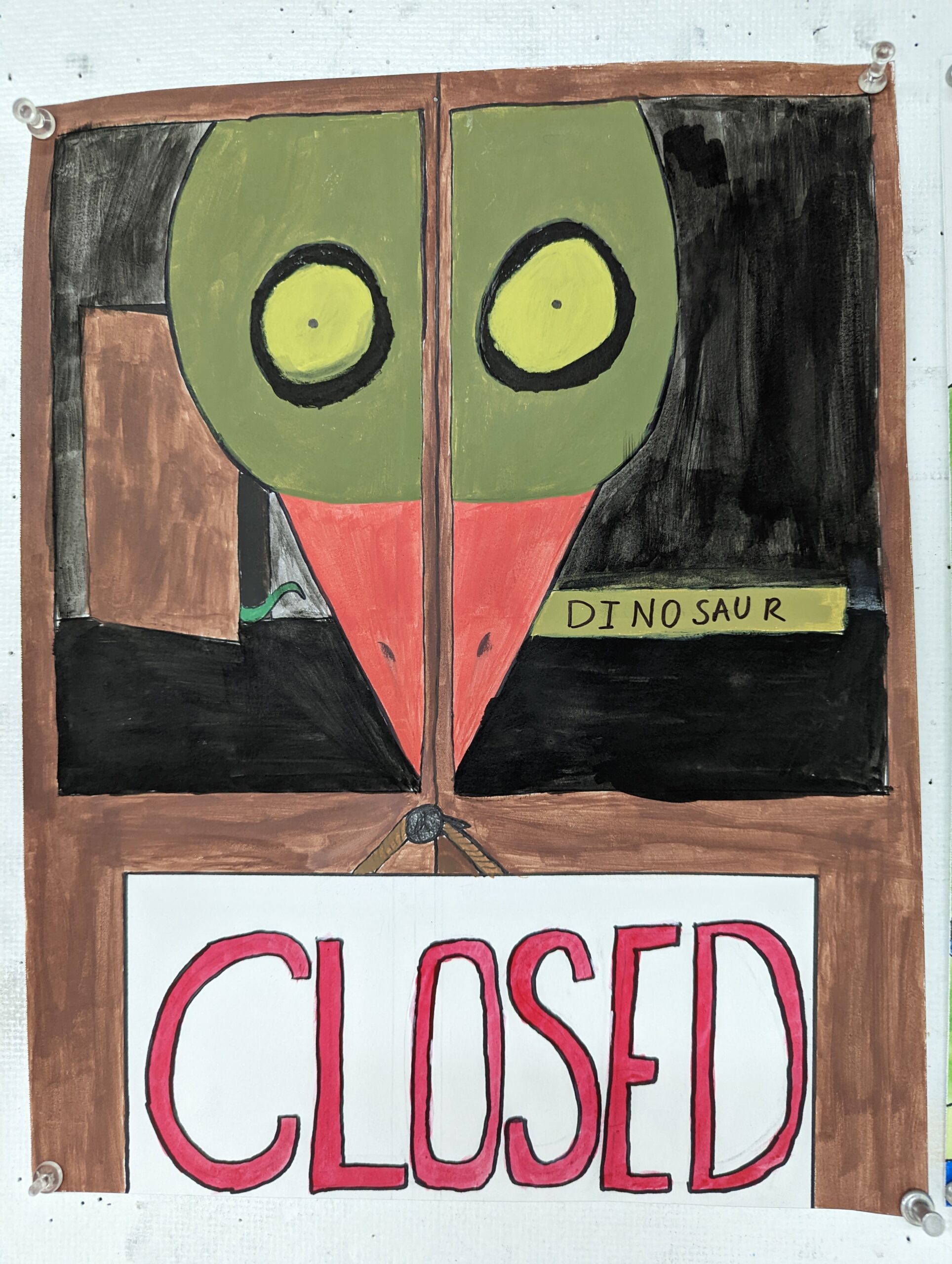
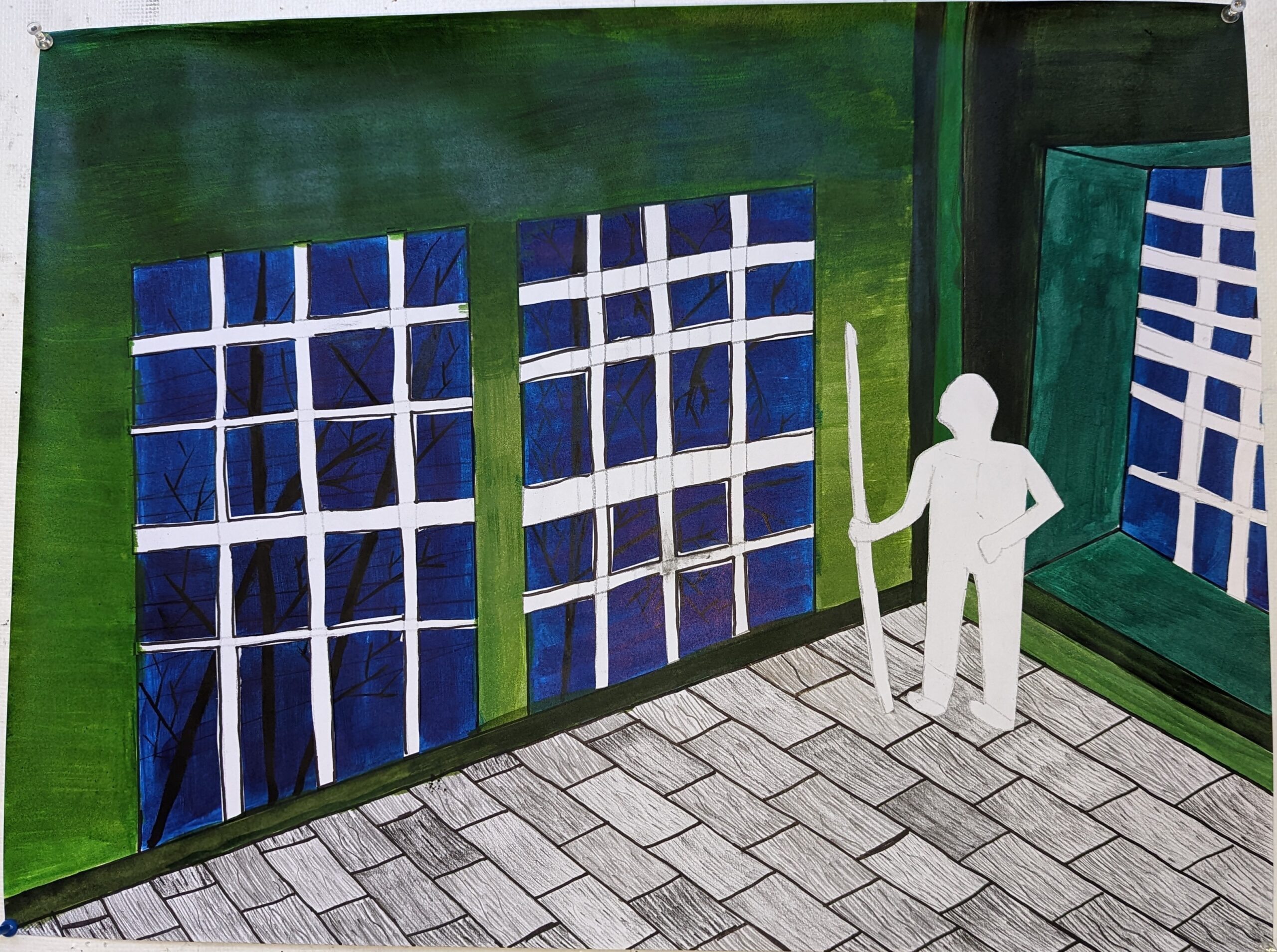
The first of the series is a piece called ‘Closed’. It was the first because it set the theme as what happens at night by portraying a closed museum. It was also a way to foreshadow the rest of the images so they could have a connecting theme other than coming to life. I wish I could’ve had a better reference for this image. The only image I had was memory and that of the bird I was drawing. Otherwise, I wish I could’ve taken a photo of the front of the Fernbank Museum. As far as materials go, I used a sharpie and acrylic paint for this portrait, along with India ink. My color palette was warm with the only exception being the octopus tentacle. The creepy feel everyone mentions really satisfied me. 🙂

‘Starry Night’

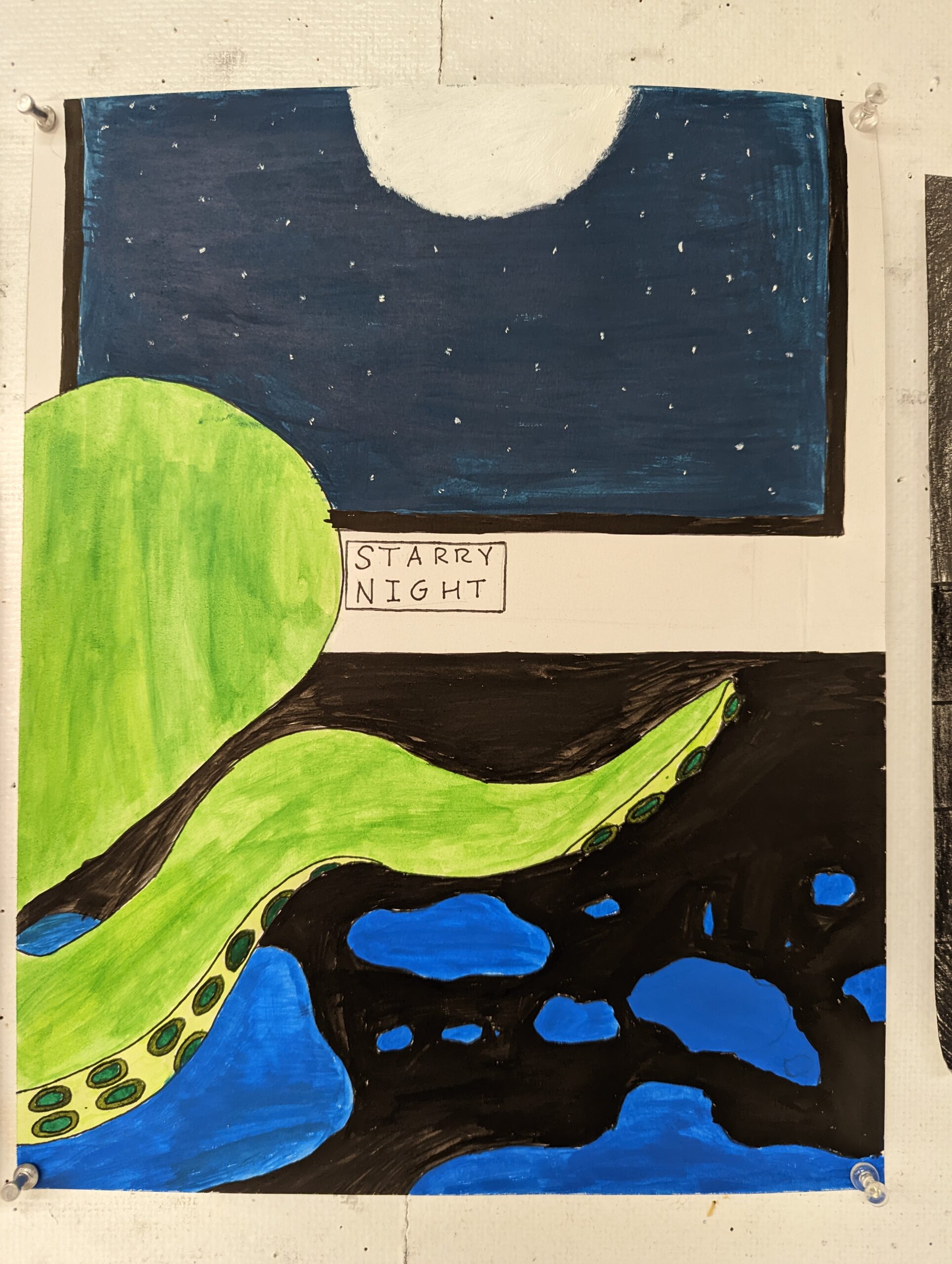
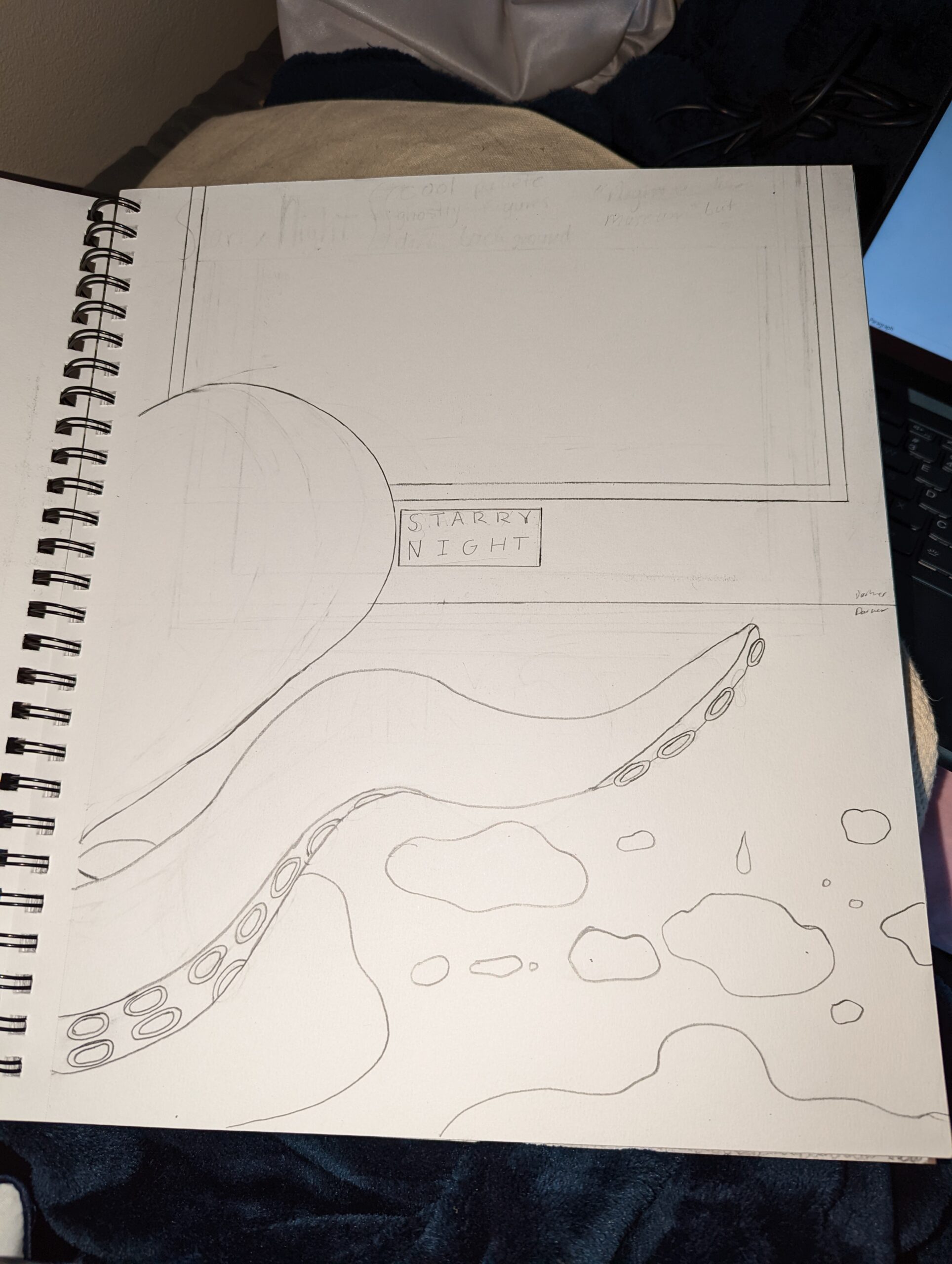
The second portrait in the series is called ‘Starry Night’ to reference the painting within the portrait but, the focus is the idea of the octopus coming to life at night. I used a cool color palette for this because of the stars at night and the eventual water I would need to use. I used acrylic paint, sharpies and white acrylic paint. for moon and stars. This portrait was one of my calmer ones to do and definitely reflects the night at the museum inspiration more.

The Dinosaur

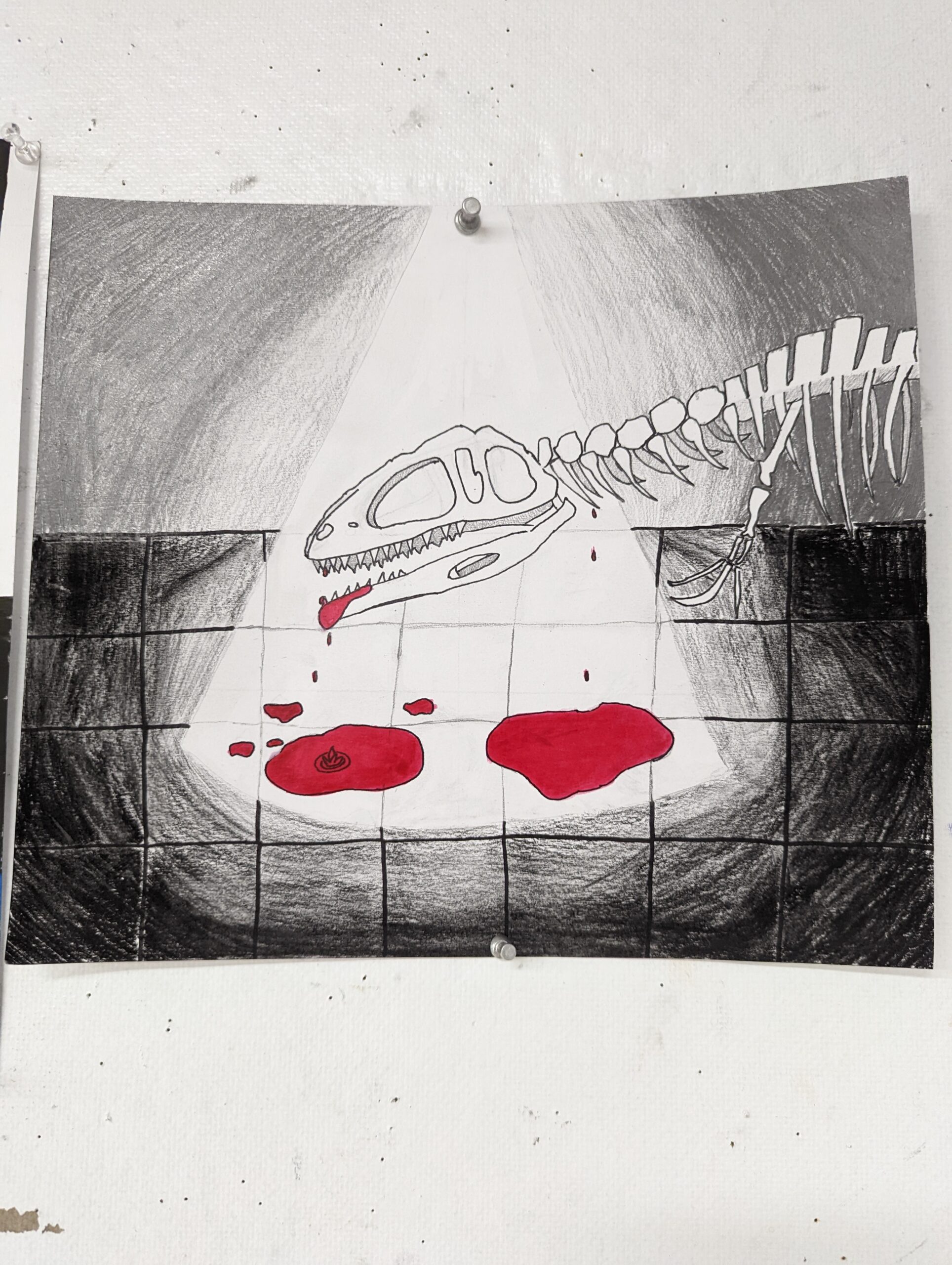
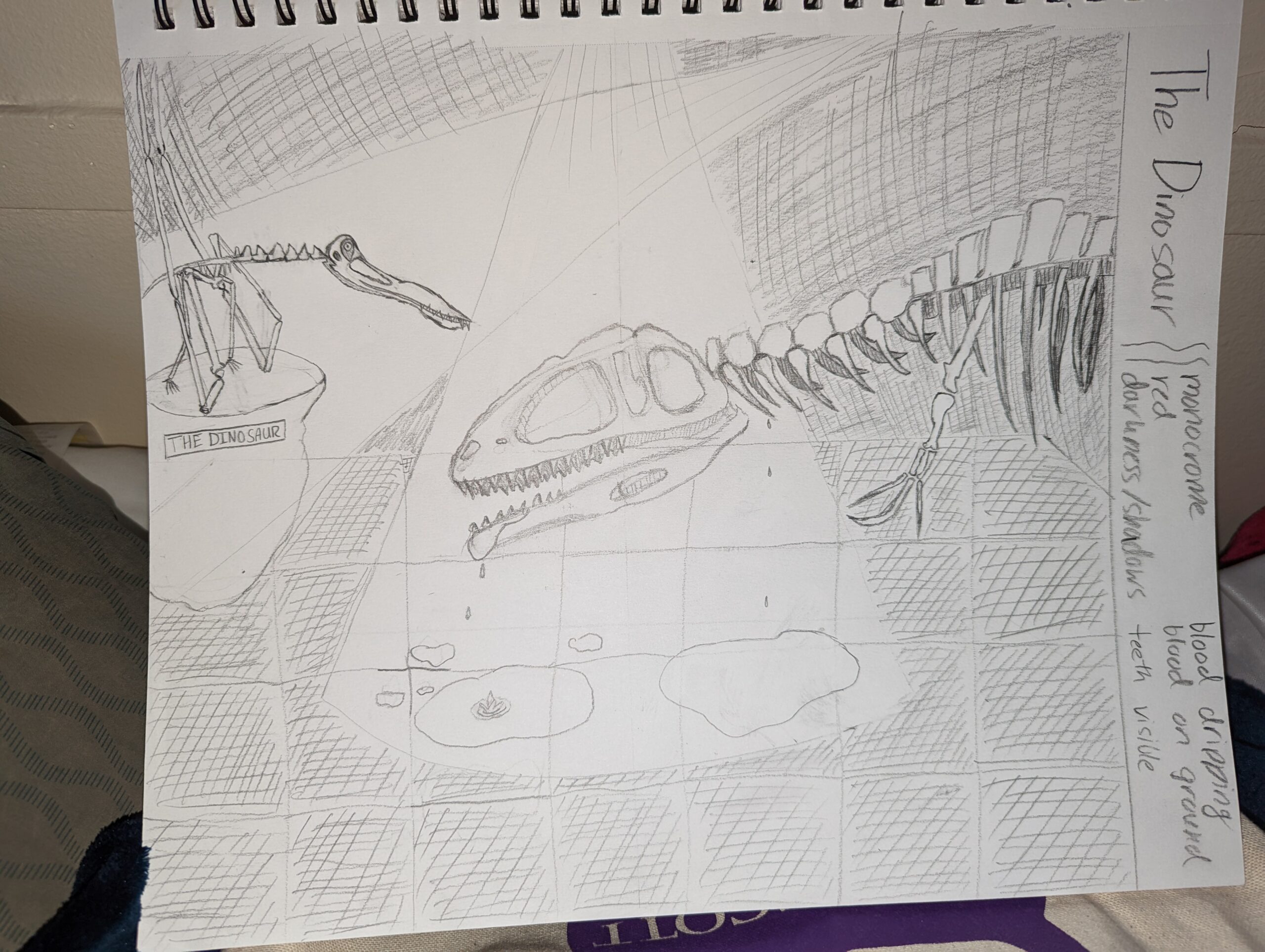
My favorite and best created one. I choose a monochrome palette and only used red acrylic paint. I used charcoal pencil and sharpie along with a white pencil. I loved being able to reflect lighting and make not only the blood pop but the general outline of the dinosaur. I also appreciated not outlining the tiles on the floor that has direct light. It would’ve been nice to add shadows and do better at creating the light. Originally there were supposed to be two dinosaurs, but I decided against it because it would take away from the darkness of the portrait. I love this piece and love how it strays from the child-like feel of night at the museum.

Progress Post

The Dinosaur

When it comes to “The Dinosaur” I plan on using red for the blood and to color some of the bones and teeth. I plan on using yellow/light yellow/white for the light and bones. The rest I will use pencil to shade in.

The Forest

The Forest composition is one that I’m okay with but don’t like as much. I am brainstorming once again what to do with it. I don’t think it will be the forest anymore. Instead, I would like to make it the first of the series and be the opener to the collection of compositions. I think I’ll call it “Closed”.

Starry Night

Referring more to the painting in the composition. I hope to use a cool color palette. this is one I’m excited to use usage of lighting in.

Mixed Media Project

This project was much harder to start up and, in the end, I feel it could’ve been better, but it ended up just feeling rushed.

I feel I could’ve executed many elements better. I felt my color tints could’ve been more clearly defined. I wished I could’ve gotten clear cut-outs for the window outlines. I also wish there was no appearance of sharpie marks or dark marks from the pencils and glue smudges.

I think I executed the wood floor pretty well as far as texture goes. I enjoyed the execution of the trees behind the window outlines. They were kind of fun and came out well I think.

I used the Mars, Charcoal and Ebony pencils for the wood floor. I also used a generous amount of sharpie for outlines. I used acrylic paint for the walls and the background of the outside. I used India ink for the trees. I also used paper from my sketchbook for the person and the window outline.

Personally, in comparison to the texture study project I believe this one had worse results because it was rushed. I hope to plan and work more generously on this project

Texture Project | Abstract of Life

In the texture project I definitely struggled with picking textures to do. I wanted to keep the number of inspirations in different locations to be kept to a minimum. Ideally, I would have been able to get many textures in photo, but I couldn’t.

Suprisingly, I was able to use my first choice of composition. I loved sketching it and just thought it would be a pretty composition. Most of the composition is rocks from outside the Dana Art Building. I was also able to emmulate some plants.

One of the plants were wispier and lighter so I tried to keep that while also keeping the overall image of the plant. One was spikier and more structured, so I wanted to make strong and clear lines. The last two were leafy plants that are smooth because of their wax.

The rocks were much harder to think about when it came to accomplishing the texture of the rocks. I wasn’t very confident in the smaller rocks because I felt they would look very fake and not like rocks. I tried to counter this insecurity by using different pencils, pressures, shapes and sizes when drawing the rocks. I wanted to be far more being uniform. That is very clear when looking at the rocks at the bottom compared to the going up the portrait. The other three rocks I did a rubbing. I was quite disappointed by the results but tried to fix them by adding extra marks or erasing.

Compared to the four drawings I wanted everything to be clear and scene. I feel I accomplished that pretty well. I also aimed to use other materials other than just the mars pencil, sharpie and vine charcoal. I used a little bit of everything in this portrait but mostly used the pencils. I still dislike working with the Conte Crayon and Vine Charcoal. I feel the ease of staining is what disappoints me most. On the other hand, I had a pleasant experience with the using the India Ink. I’m more of a painter and enjoyed fixing odd little mistakes that were made, I also loved impulsively using the ink mostly at the top of the portrait for the plants.

I would say from brainstorm to redraw, to redraw to final, this was a smooth process that had its ups and downs. I was happy to be given time to reevaluate my finished project. Last project I was in a rush and thus settled with what I had. I’m proud of this portrait and feel confident in showing it off. 🙂

4DRAWINGS PROJECT

1. How do the forms relate to the edges of the page or picture plane?

2. Is there a good balance of form and line? I would say there is a good balance.

3. Are shapes and edges clearly defined? Edges between objects and spaces can be soft or hard but should be deliberate. Yes, for most but for the drawing in the bottom left corner, no.

4. Is enough happening in the negative space?  For most yes, but in the top left one the negative space is left too open.

5. Are the shapes of spaces as important as the shapes of objects? Yes.

6. Are there a lot of stray marks, fingerprints, or smudges? Does your drawing need some added touch ups or erasing to be presentable for critique? I feel they could use some more erasing to better convey the shadows and lighting present in the drawing. There are some fingerprints not seen in the image that could also stand to be corrected.

7. Are the drawings too repetitive? Maybe a little bit when it comes to the theme of straight sharp shapes and lines.

8. Have you created a variety of values and/or enough contrast within each drawing? Use your value chart and handout as a general guide to create depth and space using variations of value. Remember there are many techniques to create value-the handout shows some examples. Yes

9. Is there anything unusual or unique in the way you interpreted the assignment? Planning ahead before going full on with markers and dark art products.

PART TWO

1. Short description of your approach to the assignment. I kind of choose to be quite the perfectionist when approaching the assignment and try to be realistic to the still life.
2.Difficulties, surprises, and/or resolutions to problems encountered. Difficulty erasing the Vine Charcoal. It took a lot more effort and definitely bothered me when making the drawing.
3.Materials you enjoyed or didn’t enjoy and why. I do not enjoy the Vine Charcoal or the Conte Crayon.
4.An assessment as to which drawing you think is the most successful of the 4 and why. Also include an assessment as to which drawing you think is the least successful and why. My most successful drawing is the one in the top right corner because it was the most well executed in every area I wanted to draw. The least successful is the one in the bottom left corner because it was rushed, and it is very unclear on what is happening in the image.
5. Feel free to include any technique goals you may have for future assignments or any final thoughts relevant to the assignment. Use the pencils for more than just the outline and for actual shading.

First Post

This is a template for your first post! Click “edit post” on the upper bar, or go to Dashboard>Posts>All Posts and click the title above to edit the content.

© 2024 My blog

Theme by Anders NorenUp ↑

css.php